Andrew Bannecker - Simple, True and Tender
« Illustrator Tutorial - How to Create a ... | Illustrator Tutorial - How to Create a ... »

Some people love to work with personal messages or important issues. Andrew Bannecker, an established digital artist who dabbles and professionalizes in vector illustration is such a person. Andrew Bannecker managed to bag reputable clients like Starbucks, Vodafone and Coca-Cola. Being the talent that he is, his work is wildly recognized by Communication Arts, American Illustration, Society of Illustrators, 3x3 Magazine and SILA.
In the world of vector illustration, Andrew Bannecker would be the first to admit that he is a nomad, consistently moving from one place to another. He was born in and started out in Kansas and then moved around the country from Seattle to Chicago, and then from New York to Washington DC, where he works and lives nowadays.
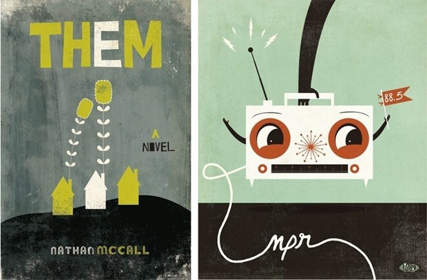
It is said that Bannecker started out in the advertising industry creating great pieces of artwork for clients. Promoting someone else probably got to him, the same way it gets to creative people. There will be a yearning for creative leverage and space. That is why Bannecker started out on his own so that he is allowed more creative space to come up with artworks like these…
It is clear that Bannecker is an incredible illustrator talent and his inclination is towards strong but simple concepts and sober colors.
Bannecker leans towards muted colors for a reason. Simply because, we feel, it brings the message out more profoundly and it makes his vector artwork stand out against the barrage of brightly colored vector illustrations.
What is interesting and different about this vector artist’s work is that Andrew Bannecker is a self-taught vector artist and he repurposes ephemera to add texture and depth to his artwork as opposed to lines, shapes and colors.
For more information about this talented vector illustrator, visit his website www.andrewbannecker.com.
PS: Andrew Bannecker is married to an equally talented woman, Amy Bannecker: http://embellishedink.com/
Comments are closed.
Comments have been close for this post.


Comments
1 Shonagh Deuchars says...
Posted at 1:16 p.m. on November 18, 2009
2 Mike says...
Posted at 10:57 p.m. on November 18, 2009
3 Stephen Barwick says...
Posted at 5:45 a.m. on November 21, 2009
4 FilterHead says...
Posted at 4:36 p.m. on November 23, 2009
5 EyeBallz says...
Posted at 12:26 p.m. on November 24, 2009
6 simlik says...
Posted at 7:57 p.m. on June 27, 2010
7 artist says...
Posted at 12:37 a.m. on April 23, 2012